elastic time
embodiment of time-based information

»elastic time« explores the ways in which time and processes can be physically represented and interacted with. There we address the challenge of communicating multidimensional data in physical space and designing physical interfaces that allow users to explore complex temporal relationships. With the goal of developing novel ideas and concepts within the field of information physicalization, we aim to bring new aspects, links, and visions into play.

The focus of this studio project was on data and information visualization and exploring ways to transmit and interact with information in multimodal physical space. We used the theme of time and time-based processes as a rather loose framework and concept. Our approach to this topic was experimental and design-research driven. Starting from a very simple question: How can we perceive time and temporal processes by means of our senses? And then explore how we can transmit and interact with information in physical space.

We started our project with a series of experimental workshops addressing different dimensions and levels of complexity. The first stage concentrated on straightforward data collection and experiments. Afterward, we proceeded to a 2D data visualization workshop and progress further to 3D visualization, concluding with the addition of interactivity. The exploratory workshops were accompanied by a dive into different related topics. e.g. time perception and the representation of time-based information.

The goal of the studio project was to design physical objects that represent, visualize, or/and interact with time-based processes. Thereby we will focus on not just the display of information but designing meaningful relationships between information, context, and user. In addition to the application scenarios and conceptual designs, the main objective of the course was the design and realization of prototypes and functional models, to be able to experience the intended interaction and the associated experience as well as possible.

During the semester we had additional workshops and inputs. For example, Prof. Till Nagel (Professor of Visual Analytics at the Mannheim University of Applied Sciences) held an input at the beginning of the course. In addition, Simon von Schmude (head of the eLab in weißensee) supported us with a physical computing workshop and also supervised final interactive prototypes. Yolanda Leask supervised the articulation of the individual concept texts. Georg Klöck did a workshop on User Flows. And Felix Rasehorn and Robin Hoske (Wint Design Lab) did a workshop on video prototyping and video documentation at the end of the term.

Supervised by Prof. Thomas Ness (Product Design, KH-Berlin weißensee), Prof. Mark-Jan Bludau (eLAB, KH-Berlin weißensee), Anna Schäffner (Cluster of Excellence »Matters of Activity«), Dominic Eger Domingos (Cluster of Excellence »Matters of Activity«), Simon von Schmude (eLAB, KH-Berlin weißensee), Yolanda Leask (concept text) Felix Rasehorn & Robin Hoske (concept video, WINT Design Lab), and Georg Klöck (user journey).

A project of the MOA design research studio Cluster of Excellence »Matters of Activity«.

Summer Term 2023
Touring Torch
an augmented ski pole
Combining elements of skiing and mountaineering, ski tours are increasing in popularity, as suggested routes and avalanche forecasts become more accessible online. This is extremely important for the activity, because it is very avalanche-prone and fatalities can happen. Even though the information to prevent such disasters is available, it is not very accessible during the tour itself.

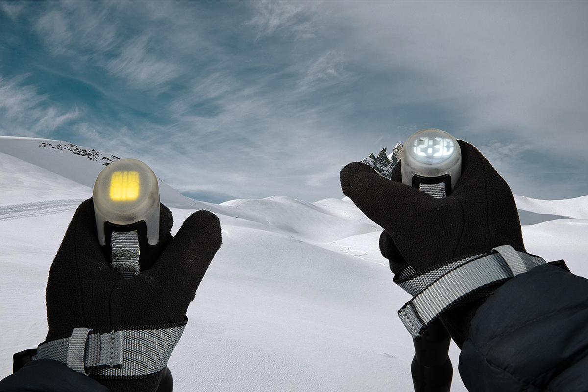
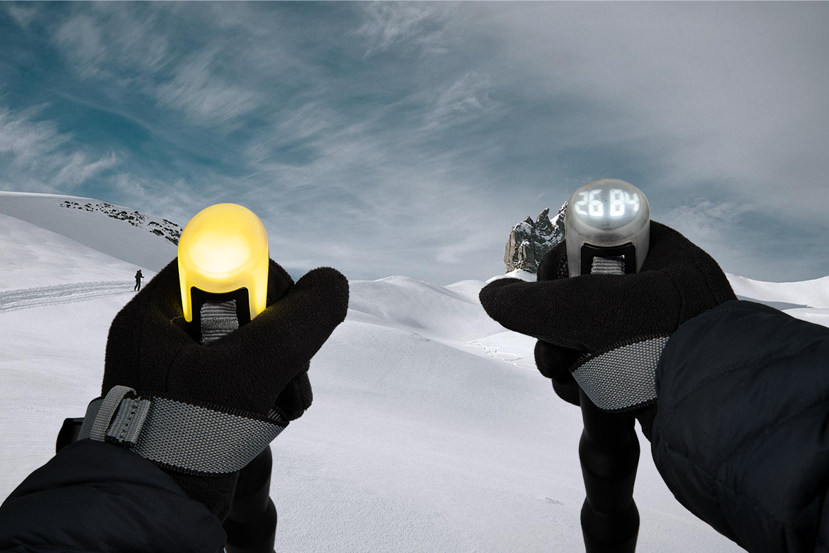
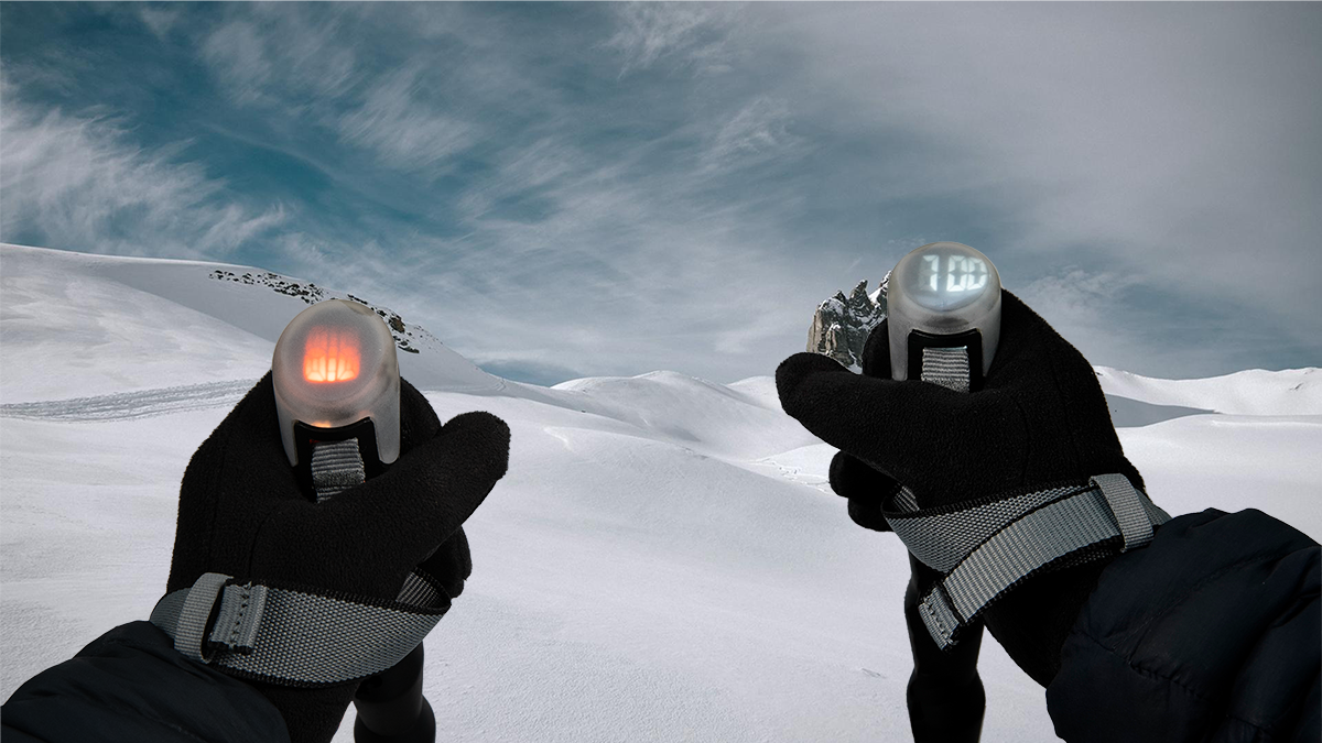
The Touring Torch is an augmented ski pole which conveys essential information, without disrupting the skier’s experience. Enabled by an app, the user inputs their route prior to departure and this is synced to an avalanche risk map of the region. There are 3 key warnings that appear if you fall behind schedule, stray from your planned route, or enter avalanche-prone areas. The display is integrated into existing equipment: an LED screen is embedded in the top of each pole grip. The pole is always present in the eye of the user during the entire tour; its small and unobtrusive display gives the user key information when needed. The LED display was chosen for visibility. Its minimal grid can display not only numbers, but also brightly coloured patterns. The two displays work in tandem and can be used interchangeably.

To access additional functionality, you hold the poles together for 4 seconds. Specific gestures trigger active functions: pointing both poles horizontally forwards in the direction of your planned route allows you to assess danger on the route ahead, while pointing at a slope further away shows the safety of that specific area. To detect elevation, the user holds the poles above their head in a triangle, like a mountain peak. Swing the poles in a circle to obtain the time.

The Touring Torch provides the skier with vital information without distracting from their main focus - enjoying their natural surroundings.
Physical Widgets
a modular information display system for bikes
Gustav Israel & Lion Beck
There is an immense breadth of digital information that can be helpful while cycling, most of which can be provided by smartphones or traditional bike computers. However the sheer volume of available information has a tendency to distract from what is really important to each individual cyclist. Moreover, digital displays have significant readability challenges in bright sunlight, which further adds to the distraction.

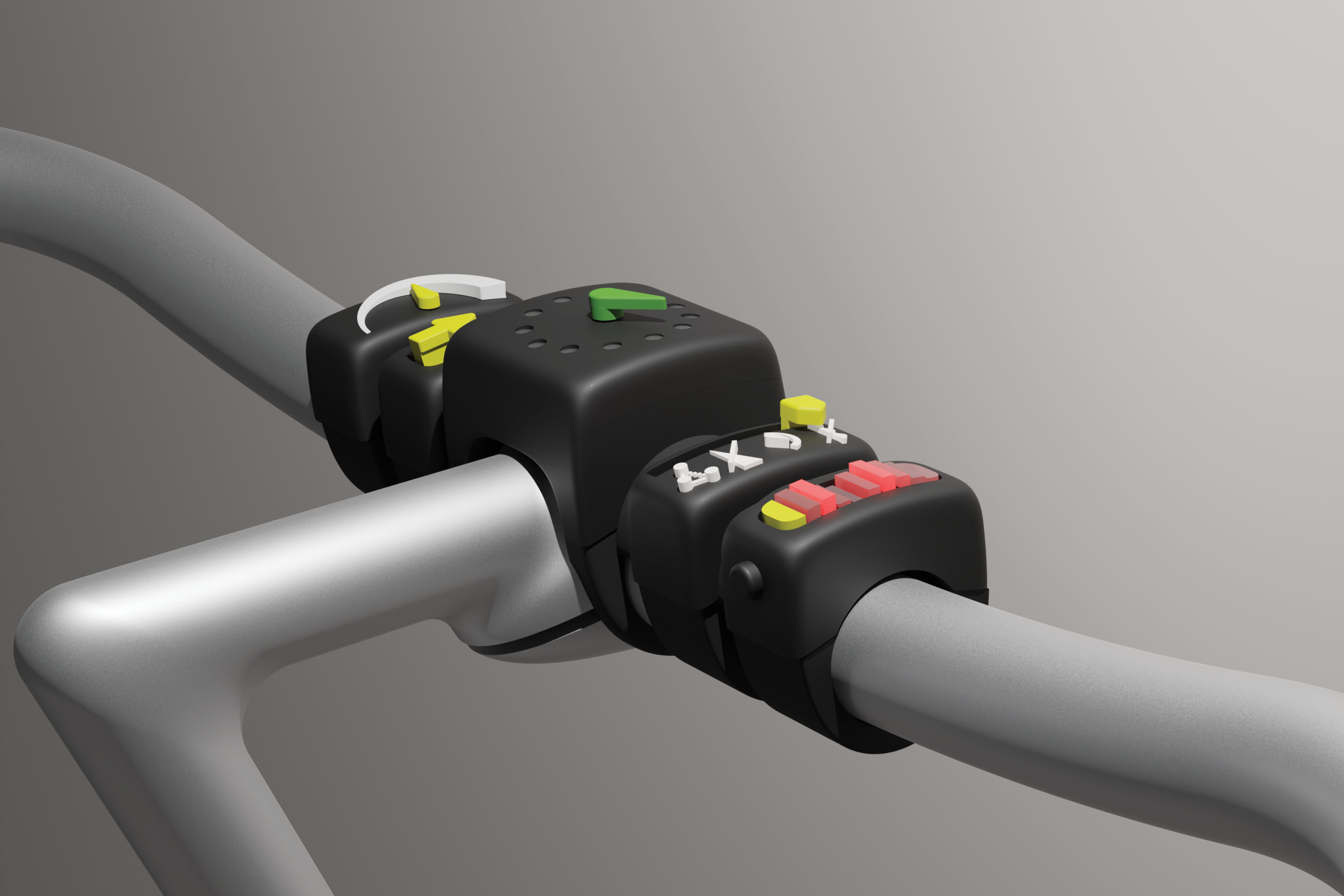
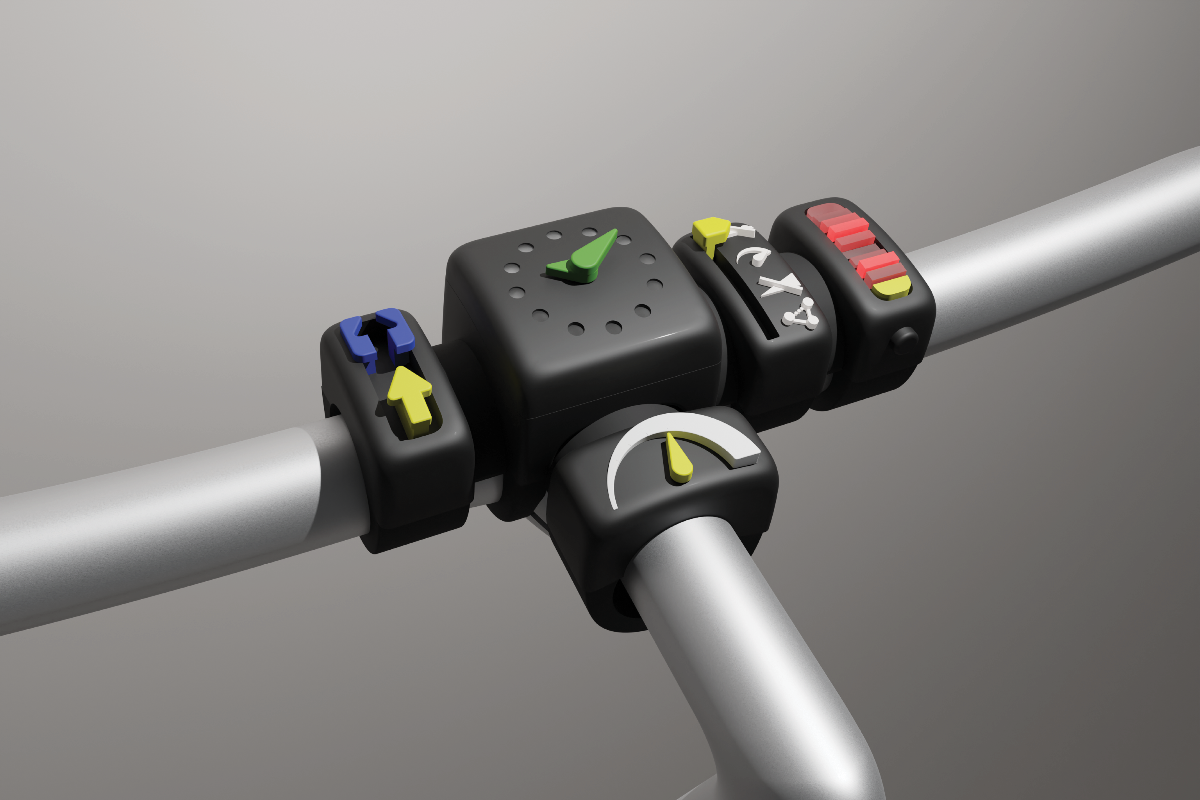
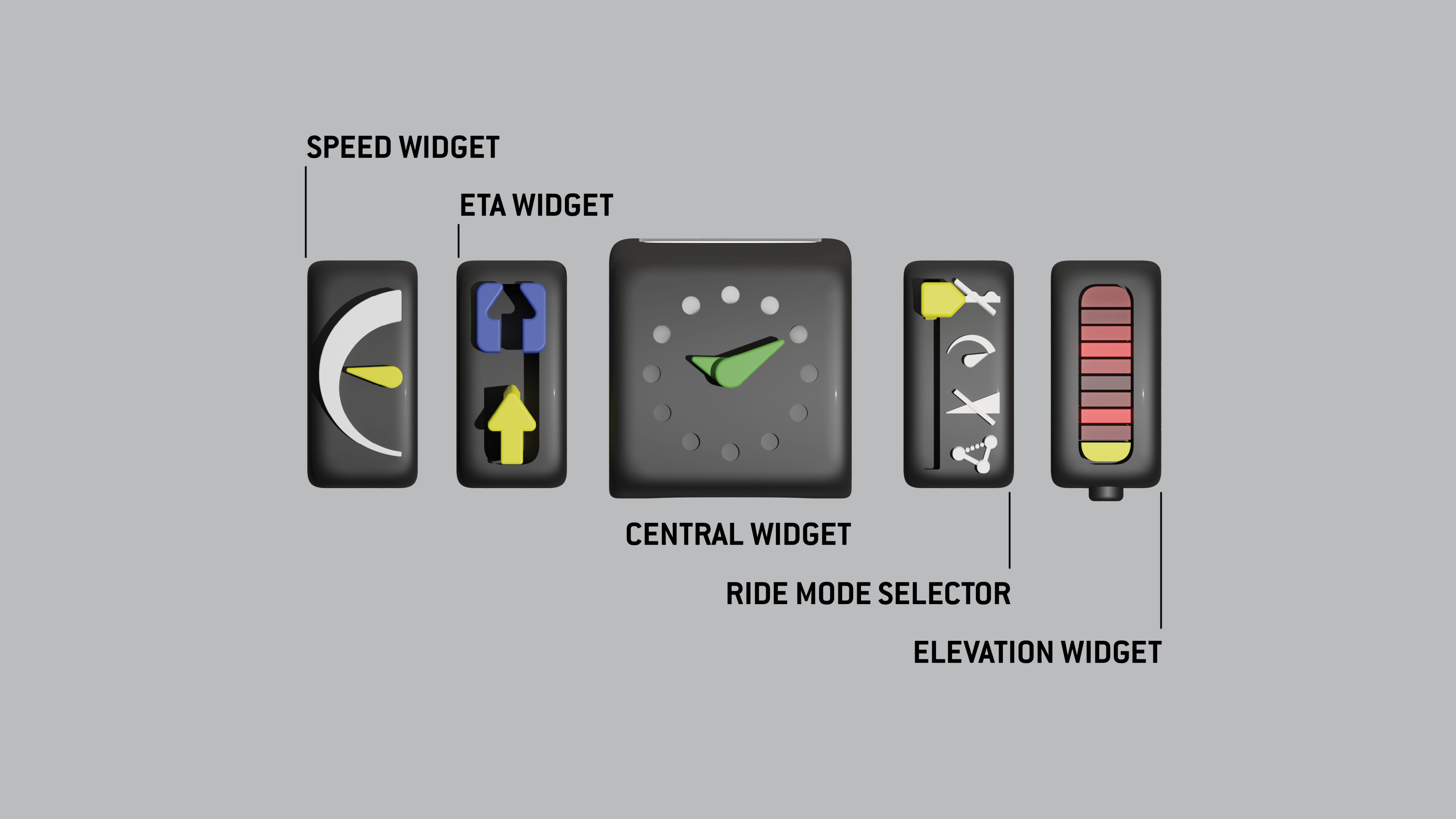
Physical Widgets allow users to focus on the things that really matter to them while cycling. It connects the full information potential of the digital world with a series of modular, analog interfaces, which can be flexibly adjusted to fit the user’s ride, be it a multi day trekking tour, a downhill adventure or just a daily commute. The system consists of one central module and a range of connectable “widgets”, each optimised to fulfill a specific task. The central module would handle the power and connectivity features, allowing the other “widgets” to be super simple.This reduces cost, justifying a larger collection of widgets, from which more varied setups can be created.

The interfaces themselves are designed to be as simple and easy to read as possible. This means no numbers, no text or intricate detail, but chunky, soft shapes with vibrant, primary colors and purely analog outputs that, if required, could even be read through touch. This allows cyclists to focus on their environment and enjoy the ride, without any unnecessary distractions.


V-Timer
can haptic feedback affect a user's perception of time in VR?
In a virtual reality environment, many people will experience considerable bias in time perception. When people wear VR glasses, they perceive time as passing significantly faster than real time. This research project explores whether it is possible to influence the perception of time in VR by other non-visual means, such as providing certain haptic feedback.

After reviewing a large number of papers on different factors affecting time perception, such as concentrating on a task, changing the temperature etc., I conducted my own experiments to see if there was a link between these factors and the conditions of a VR environment.

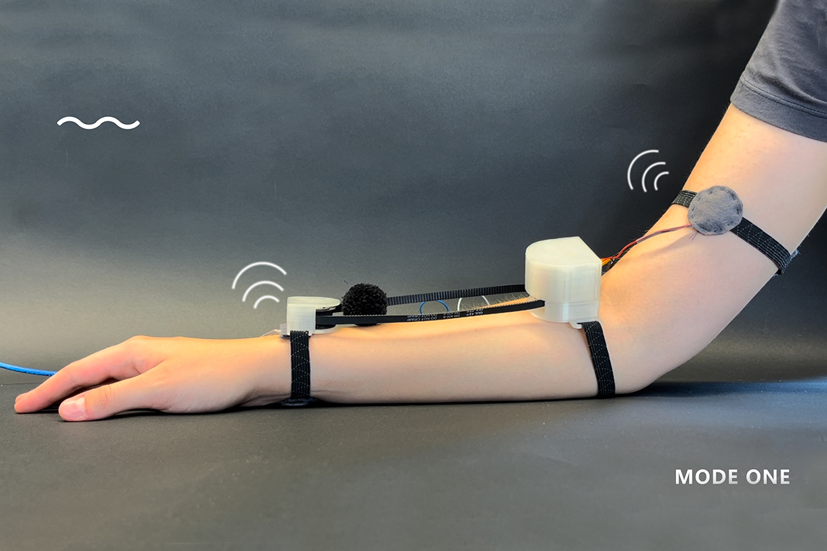
The first and second experiment required participants to perform a manual task while watching a video, to simulate a VR environment. However, it was impossible to complete the task when participants could not see their hands. Therefore the next experiment was designed to focus on receiving haptic feedback through the skin of the arms. This way, the sensory input can be perceived while the participants’ vision was focused on the VR environment. Several tactile factors, such as stroking, patting, pressing, and temperature were tested. Based on theoretical sources and experimental outcomes, tapping and stroking were determined to be the most effective forms of haptic feedback. Furthermore, a vibration motor and a stepper motor were used in combination with different textile materials to simulate this stroking and tapping on the arms.

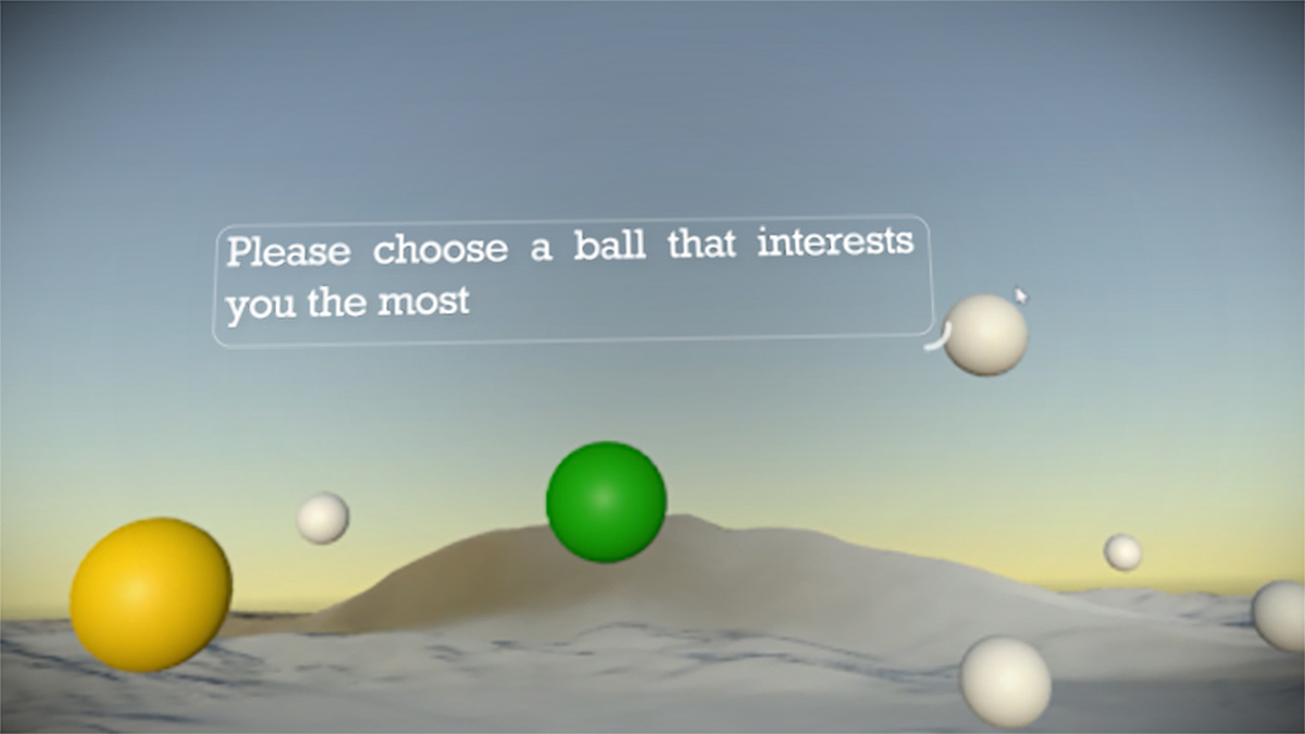
In addition to the haptic device, I designed an interactive VR environment where participants have the freedom to choose which mode of feedback they wish to experience. I aim to collect more reliable data to demonstrate that haptic feedback can effectively influence a person's perception of time in a virtual environment. Eventually, based on the above research, I will design a set of virtual environments and wearable technology devices that provide physical feedback to facilitate researchers to study different time-perception situations in virtual reality.


VR+
shoes to feel the ground under your feet in VR
You can go to fantastic places in virtual reality, but you cannot yet immerse your feet in this VR world. What if you could experience haptic feedback through your feet, simulating the experience of walking around a 1:1 model of a building, a design project or interior space? Visually possible with the latest technology, the VR walking interface still lags behind. Managed by hand controllers and joysticks, it results in an unrealistic and confusing experience of movement.

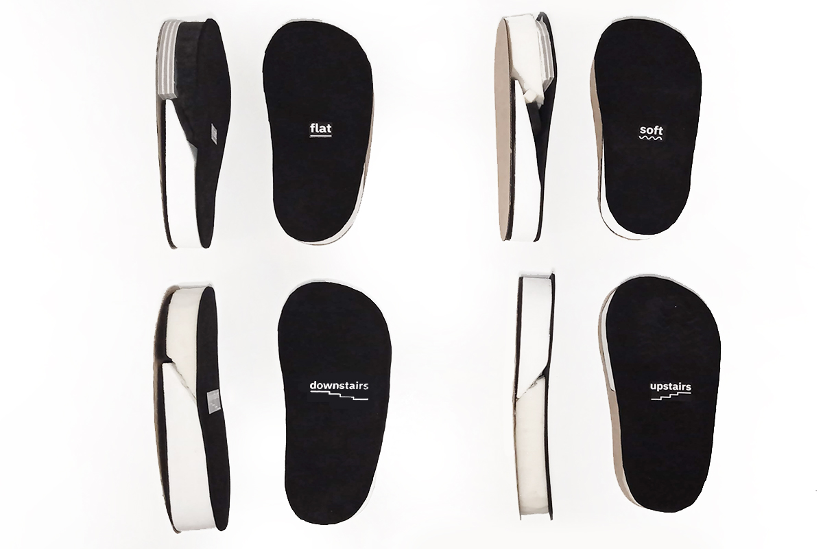
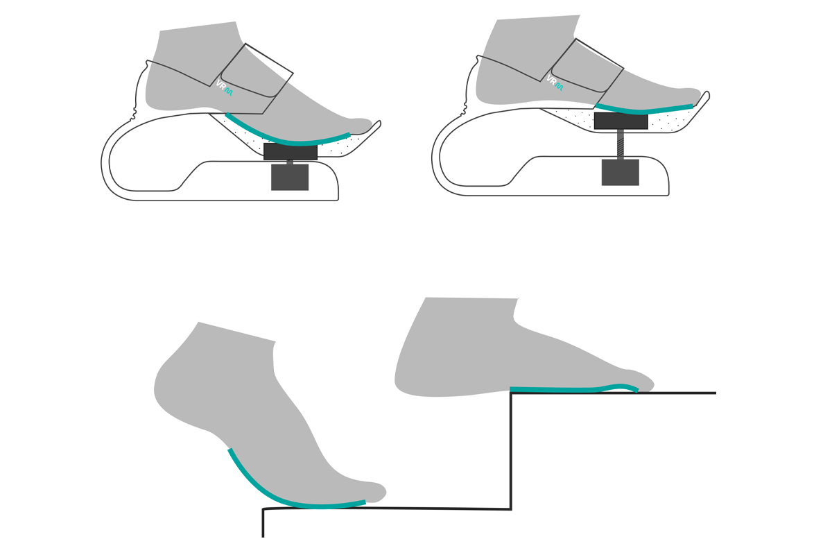
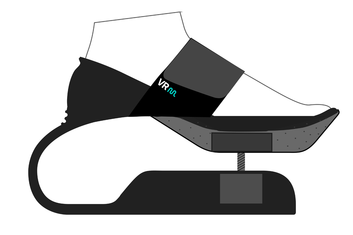
VR Boots aim to extend how users experience the ground in the virtual world. Through a dynamic sole interface, users receive haptic feedback that simulates variable ground surfaces. Not only the height and incline of the ground changes, but also its consistency - mimicking grass, sand, or concrete. It replicates the physical impact of one’s foot on this surface, for example, bouncing slightly on soft ground.

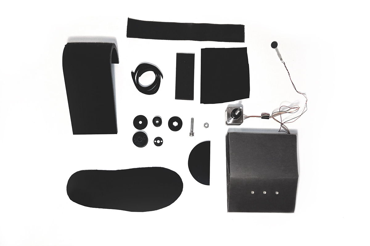
The VR boot construction consists of three parts. An upper part has fabric straps that hold the foot in place. The central part is the dynamic sole: its structure is a combination of flexible and stable areas distributed across its surface. These switch and shift from walking on a flat surface to going upstairs/downstairs. An electronic mechanism in the bottom part enables the physical effect, and consists of a stepper motor and force sensor managed by Arduino. The stepper motor is synced to a virtual map, whose data informs how the surface should change. The stepper reacts to the force of your step on a specific ground and manages the configuration of the dynamic sole. The sole then adjusts its height and smoothness accordingly, providing you with the sensation of the virtual ground.


MAREA
tide indicator
The MAREA tide indicator is a tool to familiarise visitors to the coast with the phenomenon of tides, a topic they often do not have much experience or knowledge about. Whether they know it or not, tourists’ stay at the sea will be affected by the tides. MAREA’s aim is to reduce the potential frustration and danger that could result from plans made without taking the tides into consideration.

Common tools for conveying tidal information typically have a very technical appearance, and require translation. Numbers read on a tidal chart must be converted into the motion of the water on the coast.

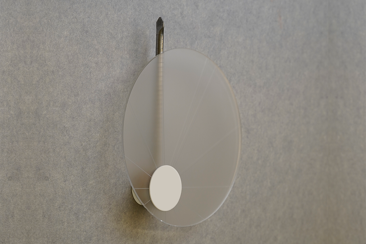
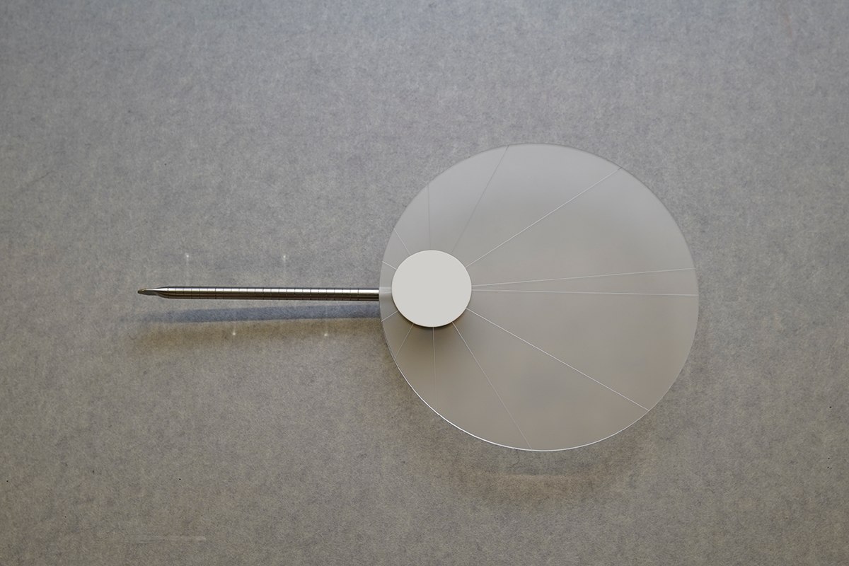
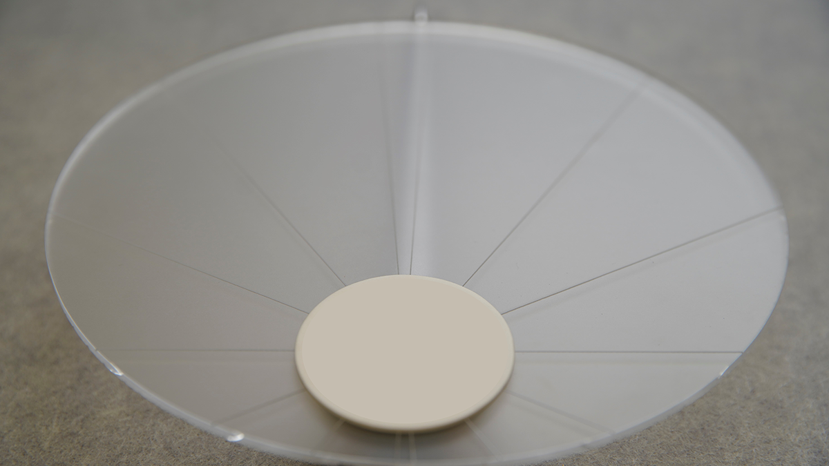
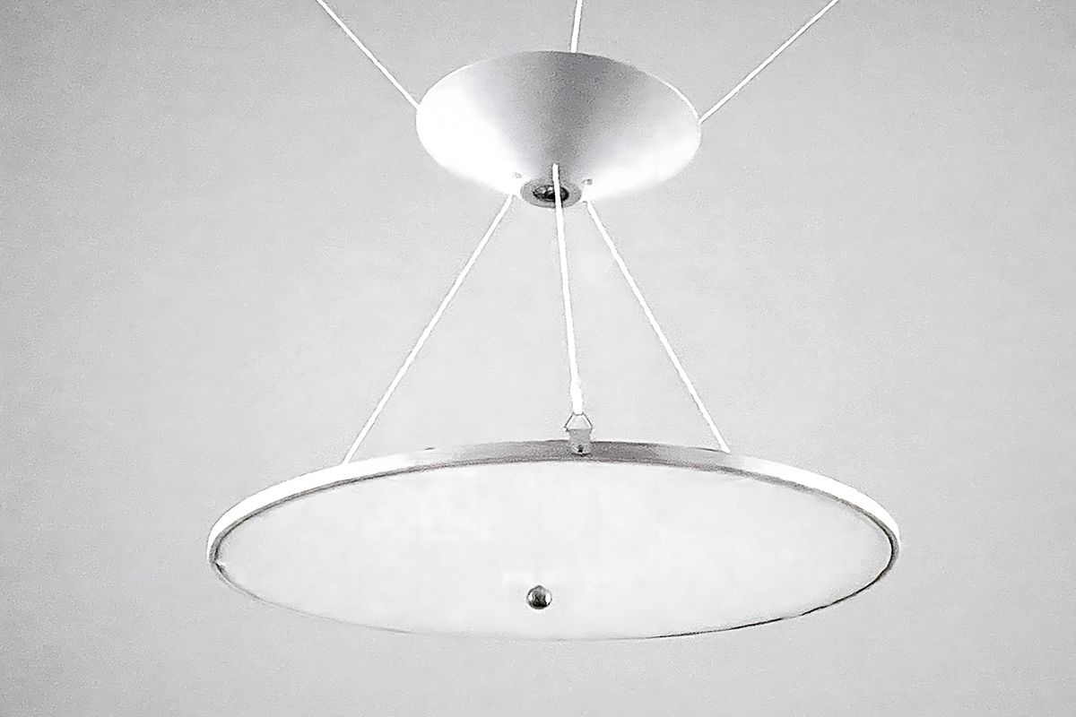
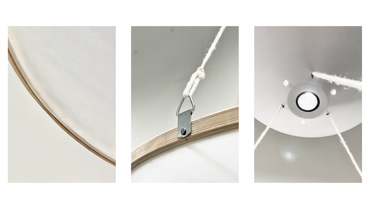
The MAREA tide indicator offers the most essential information for planning a stay at the coast in an intuitive way. A simple and aesthetic depiction of the movement itself helps visualise the sea receding and approaching the shoreline. Representing the body of water, a disc of frosted glass overlays a metal measuring rod. While the rod stands still, the milky disc rotates around an eccentric point, rising and falling like the tides. It covers and uncovers the ‘shore’, moving in sync with one full tidal period of 12 hours and 25 minutes.This visual design helps the user gain a more intuitive understanding of the tides through emotions and fascination.

When visitors require more detail about upcoming cycles of high and low tides, they can access a second layer of information by turning the rod 90 degrees to the left or right. Peaks and troughs of the tidal sinus wave are shown as light dots projected on the wall. Today’s tides are visible to the left, tomorrow’s tides to the right.

Mounted on the wall of the accommodation, MAREA’s subtle presence allows the tourists to develop a lasting sense for the movement of the water.


LUMEN UNDA
a dynamic lighting system that utilises water as a lens, shaping light through simple and elegant motion
Natural sunlight is inherently formless.
Dynamic, never static, the natural light is in constant transition - characteristics also found in water.
Light in the natural environment is never viewed in isolation. We are confronted with a random and ever-changing interplay of different elements: light shining through leaves in the wind, clouds of water vapour in the sky, highlighted by the sun, or the reflections of light on a puddle, newly formed by raindrops. Combining light with the motion of another element truly creates a natural feel for light.

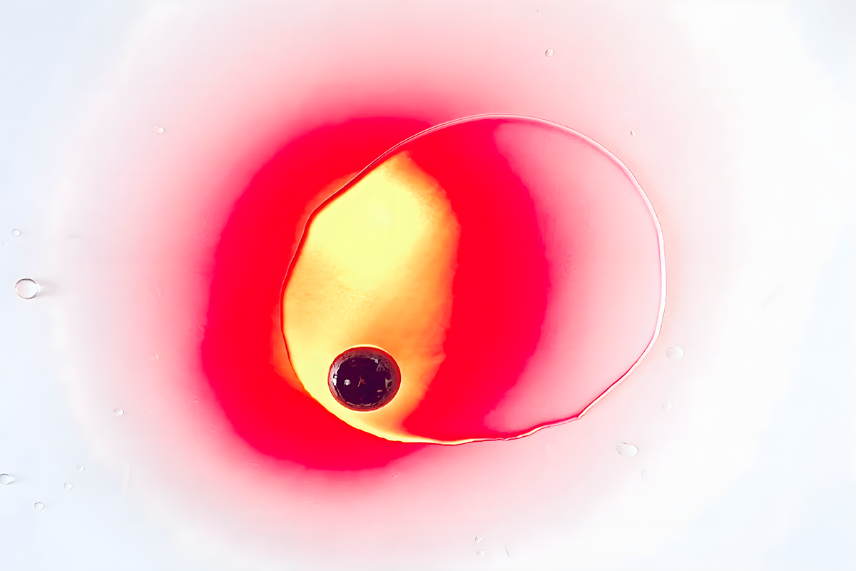
LUMEN UNDA is a minimal lighting system that utilises water as a lens, creating a dynamic light through simple and elegant motion by blending the wavelengths found in both light and water.
Emulating the natural progression of sunlight during the day, it creates a morning ambience reminiscent of a vibrant sunrise, gradually shifting to a serene sunset glow with warmer, reddish hues. 

Throughout the day, water droplets fall and accumulate in the middle of the plane, shaping the surface into a convex lens. In the morning, when there is less water, the light is more diffuse. In the evening, when more water has collected, the light is more focused. 
Just like a water droplet creating ripples in a pond, soft light spreads across your space, evoking a sense of peaceful motion. The more water being held, the stronger the ripple effect of the droplets. With each falling drop, a wave emanates and travels across the space. It’s as if the room is breathing.

latin: LUMEN UNDA english: light wave


Tempus Grid
a physical calendar that aims to streamline time management while fostering a tangible connection with appointments
Have you ever been in a situation where you forgot something important for a specific date or appointment? We all rely on our calendars to organize our lives, but as scheduling becomes increasingly digital, we have forgotten the value of physical reminders.

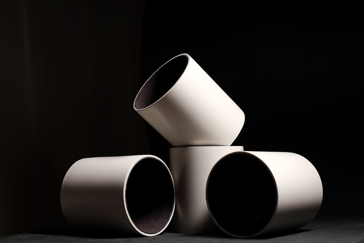
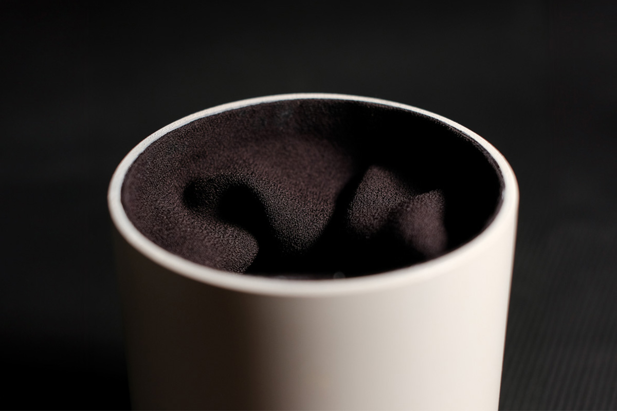
Tempus Grid is a modular system that aims to streamline time management while fostering a tangible connection with appointments. Like a physical pop-up notification, a chosen object emerges at the right moment, determined by syncing the module with a digital calendar app. Tempus Grid’s digitally- enabled analog interface consists of several sleek cylinders, which can be joined using small magnetic connectors. They can be charged and used together as a group, or used separately.

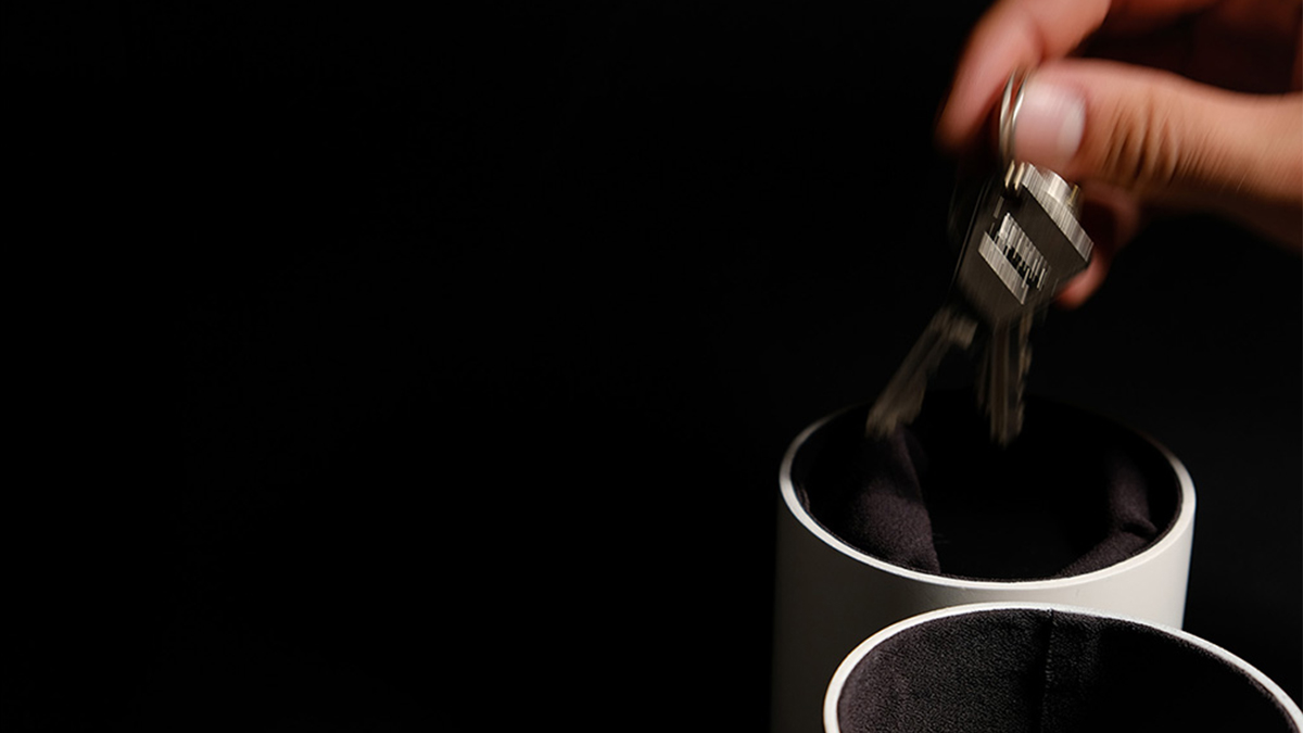
Each cylinder acts as a safety deposit box. Lined with matt black fabric, the dark depth of the cylinder acts as a stage to perfectly frame its contents. When activated, the stage elevates and presents the hidden object to the user. Like a rabbit produced from a magician’s top hat, the effect is marvellous and fascinating. Tempus Grid alternately reveals and conceals whatever is required that day. From a set of spare keys, guitar picks for band practice, to a daily dose of medication, Tempus Grid can help to automate our routines, simplify our schedules and return every object to its rightful place